The moment your eyes land on this article, typed in the standard Times New Roman font, your brain immediately prepares itself for a long and droning academic essay talking about something as riveting as the concrete beneath your feet.
A valid reaction, as certain fonts immediately create an expectation for the coming writing.
The Times New Roman font has always been associated with official and scholarly works. However, due to that, it has gained an unfavorable reputation as…boring.
Certain fonts can be used to reflect the topic and writer in itself.
However, it doesn’t take much for a font to go from being academically mind-numbing to silently screaming racism.
Stereotypes within fonts are called Stereotypography, a term coined by the design blog Graphiné. It describes the fonts used to represent certain countries or cultures without actually having any historical connection to either.
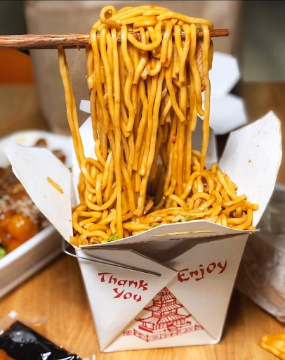
We all know the stereotypical Asian font, thick and ragged mock brushstrokes to imitate traditional brushstroke calligraphy. The font has been promptly named “Chop Suey” after an American-Chinese dish, which is an especially fitting name for the font decorating the typical Chinese takeout container in bright red ink.
The font Chop Suey is derived from its predecessor, the Mandarin typeface. By incorporating traditional Asian calligraphy brushstrokes with the Roman alphabet, they created a new typeface that would be the face of Chinese design and marketing.
The Asian community embraced it. The typeface was only made popular during rebuilding efforts in the San Francisco Chinatown district after the devastating earthquake of 1906, when locals set out to redesign the city theatrically to draw in tourists.
What is truly ironic is that the dish the font is named after, Chop Suey, can’t even be found on an authentic Chinese menu. Consisting of scraps of meat tossed in a thick brown sauce, with vegetables such as bamboo or celery thrown into the mix, it’s all made for the American taste.
The typeface was designed to fit American expectations of Chinese culture, just like the font named after it. They controlled the way Chinese culture would be represented.
Another aspect of the takeout box that does not align with Chinese culture is the choice of making the letters a bold red. In Chinese history, red ink was used to record the names of criminals, leading to beliefs that it was an unlucky color to use in writing.
While younger generations don’t care for the superstitions, older generations will consider it taboo.
Moving on from the irony of Chinese restaurants, down the street, the movie theaters have another example of culture simplification -a synonym for in favor of- consumption. A culture to fit the standards of a consumer.
The Neuland font carries the African culture in seven letters.
While most of its history was forgotten when it was introduced to American print, it gained a reputation as unreliable and difficult to handle. It was considered informal and even called ugly, some going as far as calling it a “garbage font”.
Neuland was considered inelegant and printed on cheap paper, which gave it a reputation as “primitive”. It was synonymous with circus posters that advertised “freak” shows such as conjoined twins, bearded women, and dwarves.
This link between Neuland, with “freak” shows, only further feeds into racist Black visuals.
It was created in 1923 and is designated as the title of the “African” typeface. Since then, it has been used in books and movie posters to convey themes regarding jungle adventures, exotic or ethnic imagery, and just about anything that is mildly regarded as “jungle”.
Neuland was most prominent in Hollywood on posters for movies such as Jurassic Park and Jurassic World series, Madagascar, and the Broadway production of “The Lion King”.
However, the typeface has no history with African culture. Over time, it lost its connotation as a “primitive” font, yet it still became a stereotype within the Black community.
Neuland was created by a German man named Rudolf Koch, who set out to create a typeface to advertise salvation for other soldiers traumatized by World War I.
It was meant to be a modern version of the traditional German typoface, Gothic Black Letter. German Nazis often used the font in their propaganda, and post-World War II, the font lost its popularity. However, due to difficulty reproducing the typeface which was a time-consuming process that was hard to imitate with the technology at the time, the Nazi government font was modernized into the popular typeface known today as Futura.
While Black people worked to distance themselves from stereotypes, the Chinese community embraced them as an opportunity to appeal to a new audience. Although Black Americans do not use Neuland, Chinese people use Chop Suey.
Although typefaces are not meant to be racist, typefaces such as Chop Suey and Neuland designs are. Their stereotypical basis occurs when the Roman alphabet encounters an “exotic” culture. Designers then work to water down the culture into something digestible by the public, usually without sparing a thought for the history of typefaces or cultural differences.
It is an attempt to standardize cultures.
Stereotypography is still present today entirely due to its ability to appeal to audiences. Manufacturers and designers pay no mind to the ignorant prejudice, focusing entirely on profit.
There is a very fine line between racism and stereotypes.
Fonts are often used to make a culture more “presentable” for the market. Simplicity and basic sales, usually at the cost of authenticity,